How I designed an asset management system that earned super user trust and set a new standard for scalable enterprise tools
Most design work is built around empathy. But what happens when your users don't want to be understood? They just want a tool that works. That was the challenge waiting for me at Sempra Energy.
Overview
Sempra Energy and its affiliate San Diego Gas & Electric (SDGE) manages over 500,000 grid assets spanning 15,000 miles of infrastructure. Electrical engineers needed a centralized tool to filter, analyze, and prioritize those assets for government-mandated replacement projects. I led design for the MVP from the ground up.
A small team of 5 to 10 highly specialized electrical engineers responsible for selecting assets for multi-year infrastructure projects. Technically fluent, data-driven, and deeply pragmatic. Not a typical user group.
Replace a fragmented patchwork of PowerBI dashboards and Excel spreadsheets with a single, centralized asset management platform built around how engineers actually work.

Pain points
Engineers had to weigh dozens of variables when selecting assets for a project, but the data to do that was scattered, slow, and often outdated by the time it arrived. The tools weren't just inefficient. They were actively working against the people using them.
Newer consolidation tools weren't built for engineering workflows, so most engineers defaulted back to spreadsheets.
Data was spread across multiple disconnected tools, requiring constant context switching to complete a single assessment.
Engineers had no visibility into which assets were already slated for replacement, leading to redundant selections.
Data requests were slow. By the time information arrived, previous assessments were often already outdated.
Projects moved through 13 disconnected systems with no shared data, creating bottlenecks at every phase.
Long project cycles and manual tracking created delays that slowed grid modernization efforts across the organization.
Business solutions
Accenture was brought in through a phased approach: first a centralized asset tracking dashboard, then a project management layer to track assets through the full project lifecycle. I joined during Phase 1, responsible for designing the core product experience.
The subject matter had a steep learning curve. I had to understand how electrical engineers think about asset prioritization before I could design anything useful for them. Stakeholders were hard to reach and more interested in the finished product than the process. And the user group itself was unlike any I had worked with before.
I couldn't design for electrical engineers without understanding their world. I spent my early weeks studying grid infrastructure, asset risk frameworks, and how prioritization decisions actually get made before touching a single wireframe.
Utility companies don't publish their internal tools. I pulled inspiration from GIS platforms, navigation applications, and data-heavy enterprise products to understand how experts interact with complex geospatial data at scale.
The engineers were overworked and hard to pin down. I worked around their availability, maximizing the feedback I could get from a limited number of touchpoints rather than relying on a traditional testing cadence.
Design solutions
The asset management experience required designing for precision and data density. These are the key interactions I designed, and the thinking behind them.
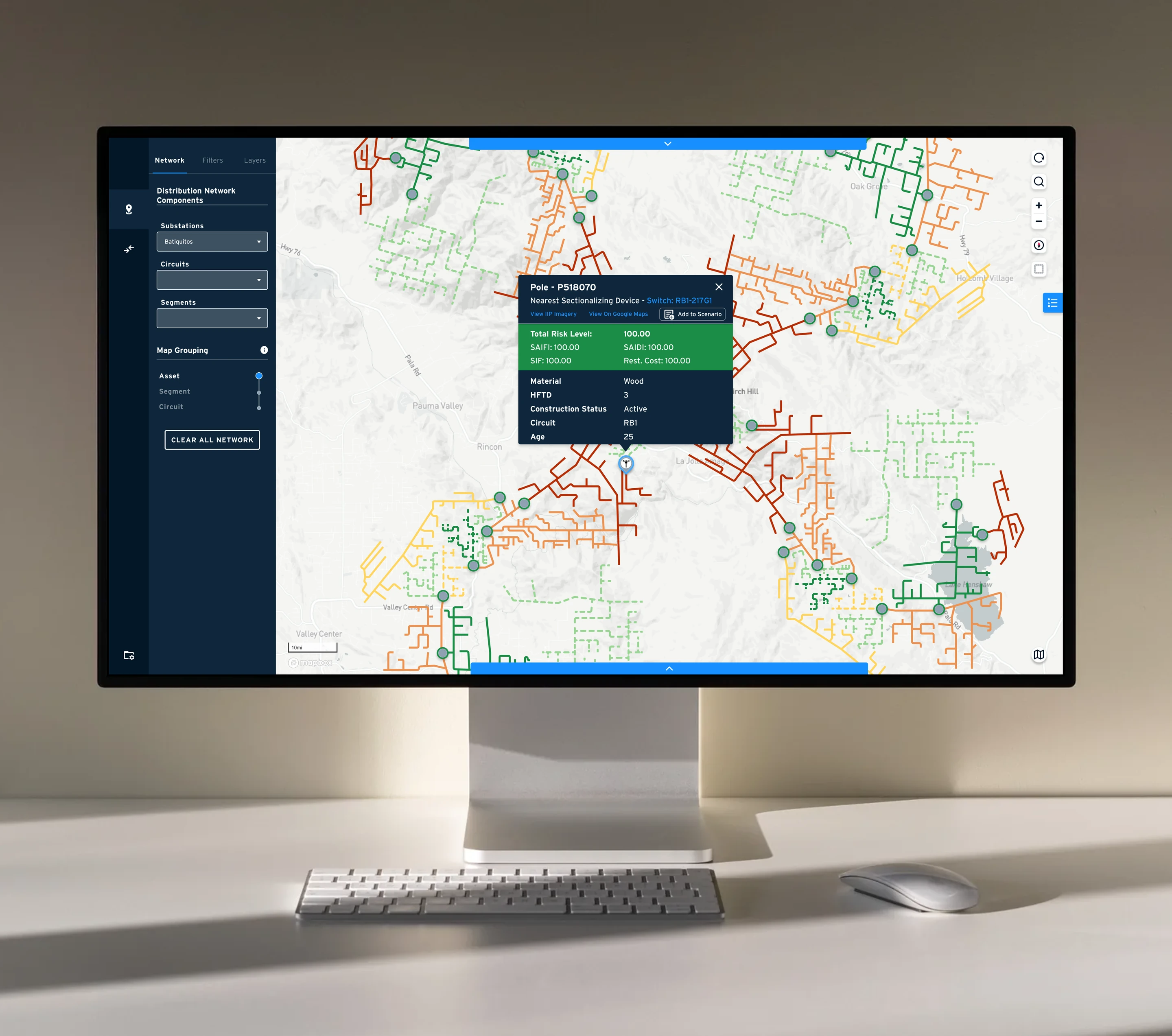
Asset map
Challenges
- Engineers needed to visualize hundreds of thousands of assets simultaneously without the map becoming unreadable.
- Filters and contextual overlays served different purposes but risked being conflated in the UI.
- Asset types varied between point locations and line-based infrastructure, requiring different visual treatments.
Solutions
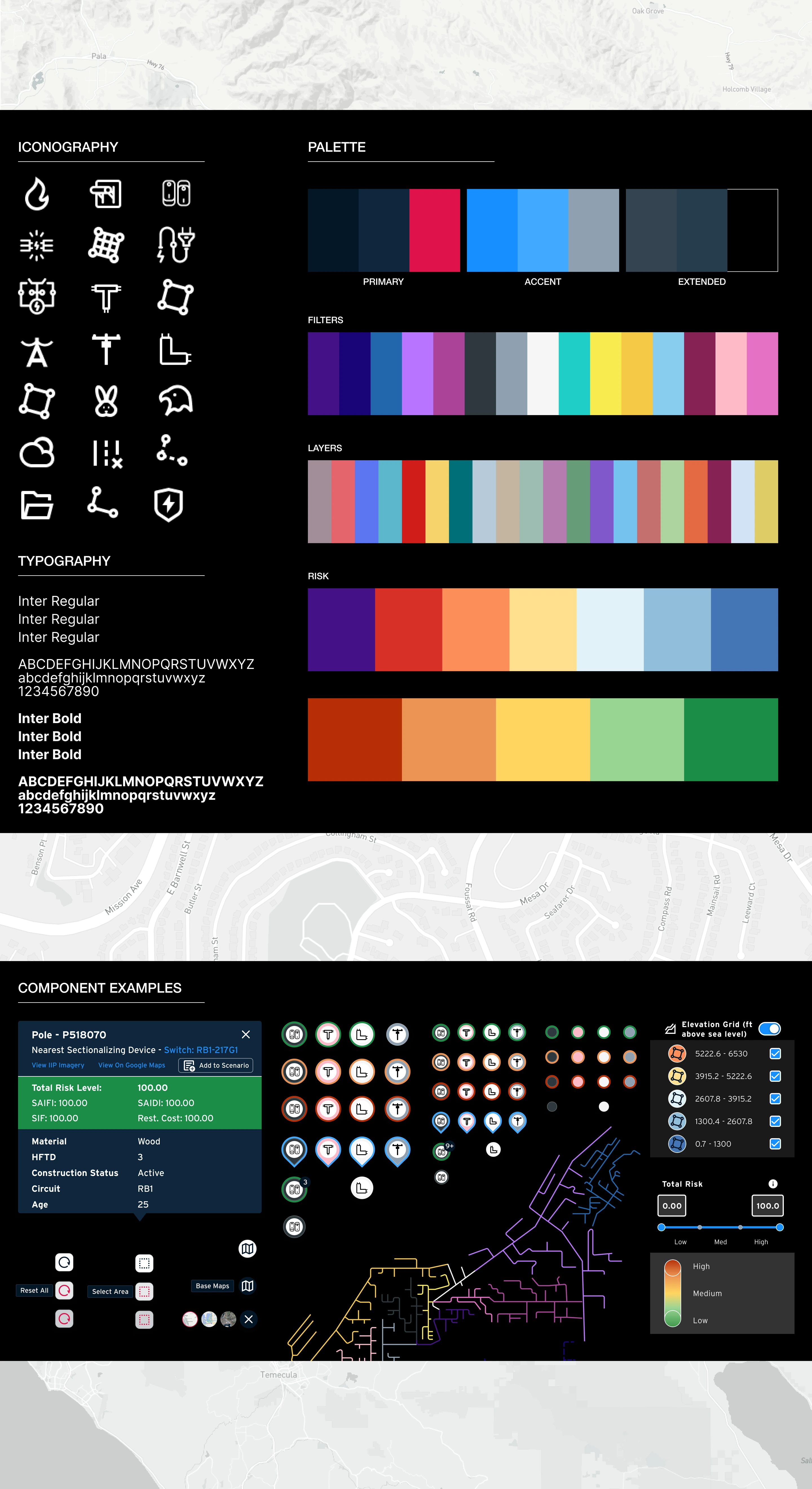
- Separated the left panel into Filters (which assets appear) and Layers (contextual map overlays), keeping two distinct concerns from colliding.
- Introduced icon-based pins with color coding for point assets, borrowing conventions from mapping tools engineers already recognized.
- Used solid and dashed line treatments for line-based assets like power cables, following established GIS conventions for immediate legibility.
Asset selection
Challenges
- Some engineers needed granular, asset-by-asset control. Others worked at a network segment level. The interface had to support both without forcing a compromise.
- Engineers needed quick access to summary data without losing sight of the broader map context.
Solutions
- On-map selection triggered a popover with a quick attribute summary, with an expandable sidebar for deeper asset profiles.
- Designed a customizable data table at the bottom of the screen modeled on spreadsheet conventions, with add/remove columns and aggregate summary metrics above the table.
- Added a toggleable overlay showing which assets were already included in active projects, reducing redundant selections.
Project cart
Challenges
- Engineers often evaluated multiple candidate asset groups before committing to a selection.
- Finalizing a selection required exporting data in a standardized format for the next project phase.
Solutions
- Designed a cart system for grouping assets dynamically, with support for both individual selection and bulk add.
- Built a side-by-side cart comparison view so engineers could evaluate multiple groupings against each other before committing.
- Checkout exported the finalized asset list and relevant data points to a standardized file, creating a clean handoff to the next project phase.
Project end
As the project approached its final deadline, the team convened in person for a full week. It was the first time everyone had been in the same room. Problems that had resisted resolution over months of remote work were closed quickly. Whiteboarding sessions did in hours what video calls hadn't managed in weeks.
At the end of the week, we presented the final designs to the client. I walked the engineers through how their early feedback had shaped specific decisions. The shift in the room from our first workshop was significant. The moment I remember most came from the engineer who had been the most dismissive of the design process at the start. After seeing the final product, he said: “I love the way this looks. It's so simple.”
The MVP launched on schedule and within the client's timeline.
Showcased at an industry expo and used in pitches to prospective utility clients.
The tool was selected as a proof of concept for Accenture's broader utilities practice.
The application has continued to evolve, adapted for new clients beyond its original scope.
Aligned and packaged with several Accenture provided platforms and services.
Conclusion
This project tested me in ways I hadn't encountered before. The domain was unfamiliar, the users were skeptical of the process, and the feedback loops were limited. There was no room to rely on intuition alone.
What it taught me is that user-centered design doesn't always look the same. For this audience, it meant setting aside assumptions about what users want from an interface and focusing entirely on precision, efficiency, and respecting their expertise. Earning trust from people who don't believe they need a designer is a different challenge than earning it from people who do. It's one I'm glad I had early in my career.