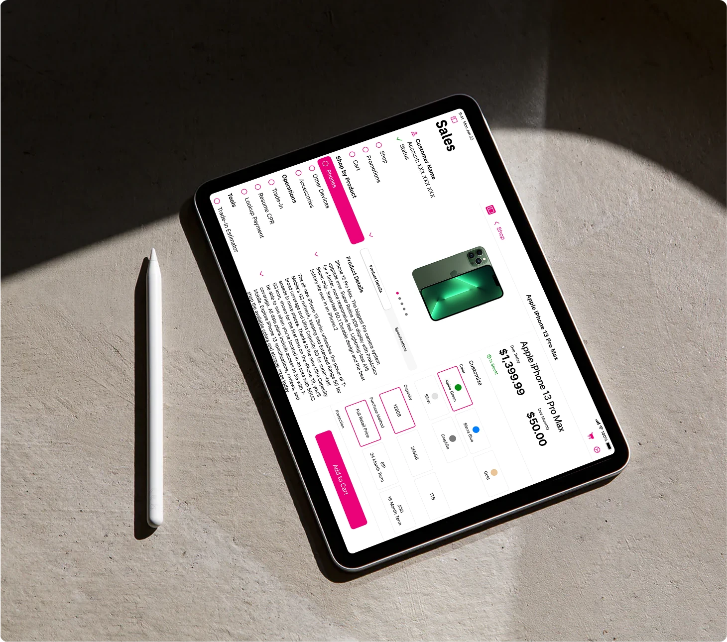
How I overhauled an outdated mobile POS system during the pandemic, increasing user satisfaction by over 30% and gaining key career lessons
While emerging technologies often dominate the headlines, many frontline employees still rely on outdated tools that make their daily tasks frustrating and inefficient. This was the reality for T-Mobile's in-store Mobile Experts, who used an iPad-based POS system riddled with usability challenges.
Overview
T-Mobile's retail in-store employees (Mobile Experts) were in need of a long overdue update to the applications on their iPad devices. I led the design of Sales based workflows while also navigating business challenges during a global pandemic.
T-Mobile's North American based retail employees in charge of handling store operations, servicing customer's accounts and any sales or return transactions. Stores could range from malls to pop-up tents, serving 10s to 100s of customers a day.
The Native iOS Journey: Rebuild and consolidate all of the applications Mobile Experts use daily into one seamless set of integrated applications designed specifically to run on Apple iPads.

Banners like these contain tidbits of the lessons I learned while on the project that would shape how I approach the next 5 years of my design career. Click in and learn more!
Rather than a single, cohesive experience, the current system was a patchwork of over 50 different applications, each handling a separate aspect of the retail process. This fragmentation created constant friction:
These challenges didn't just slow down transactions—they led to customer frustration, lost sales, and employee burnout. It was clear that this project wasn't just about redesigning an interface; it required a fundamental rethink of how Mobile Experts interacted with their tools.
Frequent system crashes forced Mobile Experts to restart transactions when switching between apps.
There was no way to save progress mid-transaction, meaning a simple pause—whether to check stock or assist another customer—often required starting over.
Many tools were designed for desktop, not touch, making interactions slow and unintuitive on a tablet.
The promotions system was opaque, requiring Mobile Experts to verbally reassure customers: “Trust me, your discount will show up on your bill later.”
Inventory tracking was unreliable, forcing employees to leave customers waiting while they manually checked the stockroom.
No connection between online and in-store shopping meant that if a customer started a transaction online or at another location, they had to start from scratch in-store.
Even well-known organizations struggle with inefficiencies, miscommunication, and gaps in process. A great designer isn't just a problem solver for users but also for the teams they work with.
Business solutions
By the fall of 2020, leadership shifted priorities, forming a new team to completely overhaul the Upgrade experience, from start to cart. This transition became a turning point in my career. It was where I found my confidence, established structure in my work, and built real influence with the client.
As the project progressed, I became a trusted subject matter expert on the Upgrade process—an area deeply entangled with complex financing, promotions, and trade-in specifications. This expertise strengthened my relationships with key client directors, leading to a completely new upgrade flow on track to launch with the other MVP experiences.
To navigate the project's complexity, I proactively identified and secured two key client stakeholders who could meet multiple times a week to provide clarity, approve designs, and even coordinate small groups of users for testing and feedback. This direct access allowed me to work more efficiently and make user validation a core part of the process, despite the challenges of remote collaboration.
I also worked alongside three dedicated project managers who helped bridge the gap between design and development by refining user stories and aligning priorities with the client. Over the next two years, we tackled multiple high-impact sales flows while navigating time zone differences, virtual user testing constraints, and fully remote design reviews.
By establishing a shared design language and component library, we ensured consistency across all workflows and reduced handoff friction with the development team, allowing us to ship faster without sacrificing quality.
No one will hand you a roadmap. You have to proactively create structure, drive alignment, and ensure your work adds value.
Design solutions
The Sales experience required designing for high complexity and high stakes. These are the flows I led, and the thinking behind them.
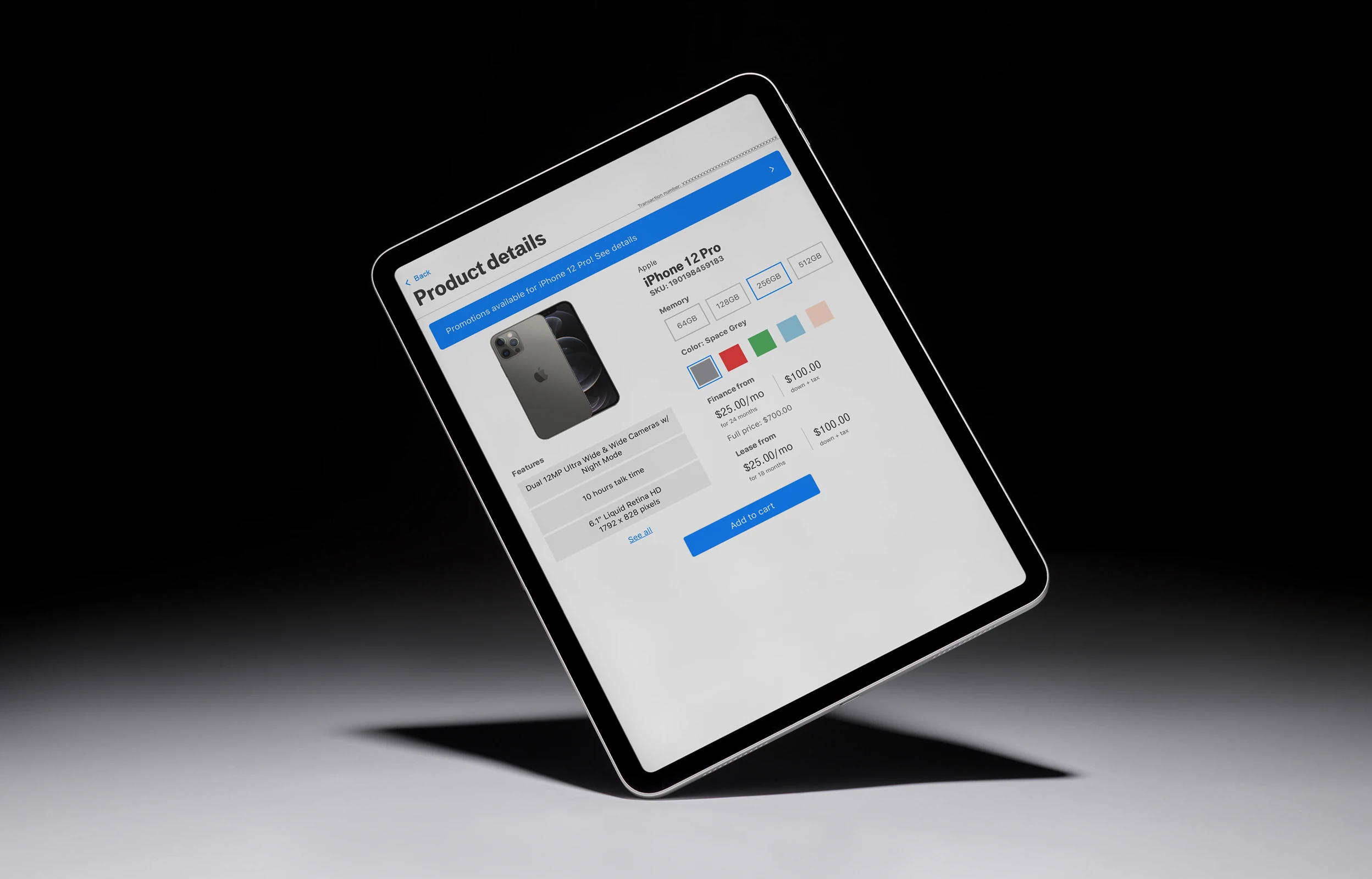
Upgrade
Challenges
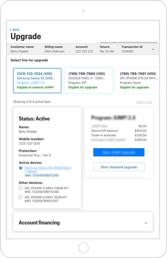
- Accounts with multiple lines created ambiguity about which line was being serviced.
- Upgrade eligibility varied by line, requiring flows that weren't clearly differentiated.
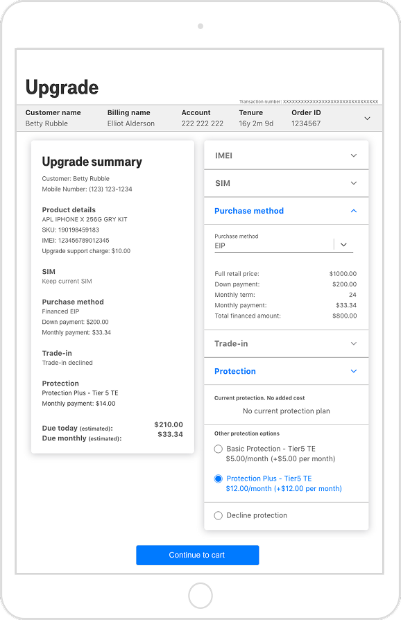
- Add-on services were scattered across the flow, creating decision fatigue before checkout.
Solutions
- Line selection carousel surfaces eligibility status upfront, reducing Mobile Expert error before the flow begins.
- Contextual line detail view guides Mobile Experts through the right upgrade path for each customer.
- Consolidated summary page collapses all add-on decisions into a single structured menu.
Trade-in
Challenges
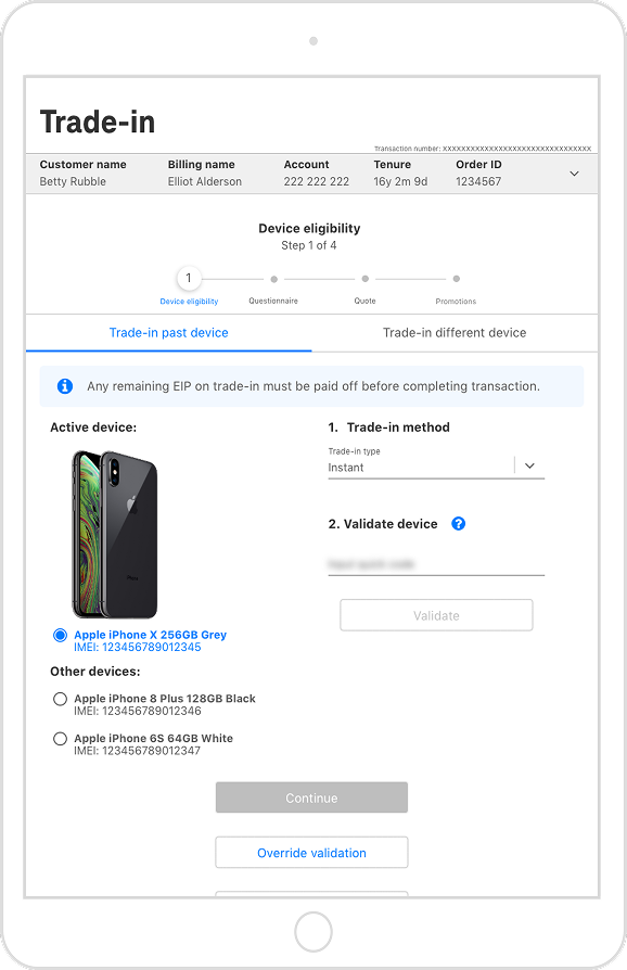
- Trade-in entry points were fragmented across upgrade, standalone, new customer, and promotional flows.
- Without device images or account-linked specs, Mobile Experts frequently selected incorrect devices.
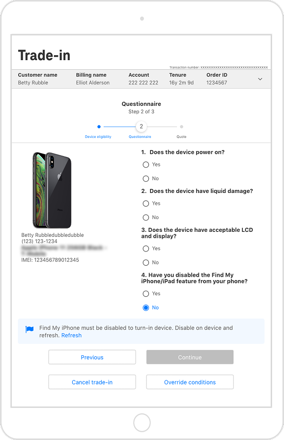
- Manager override was buried and difficult to execute despite being a frequent workaround.
Solutions
- Consolidated all trade-in types into a single unified flow, requiring stakeholder alignment given the dev lift involved.
- Surfaced account-linked devices with images and specs, removing identification ambiguity at selection.
- Elevated override controls with clear labeling, acknowledging real-world usage patterns over ideal system state.
Cart
Challenges
- A single cart view couldn't serve both quick transaction summaries and detailed troubleshooting needs.
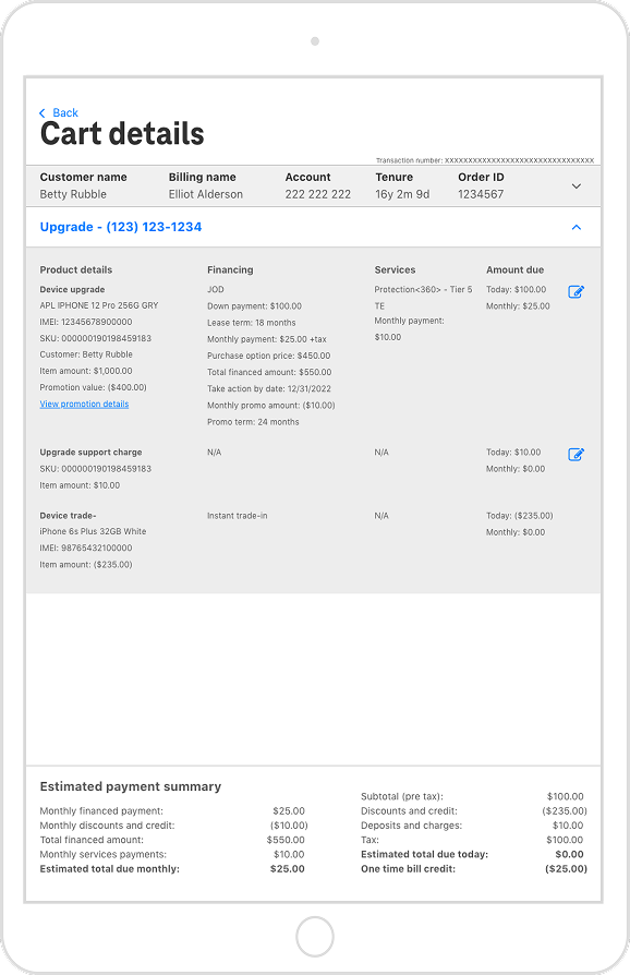
- Financing produced a high volume of numbers requiring clear separation to be useful under pressure.
- Cart was also a launch point for additional transactions, requiring wayfinding without cluttering checkout.
Solutions
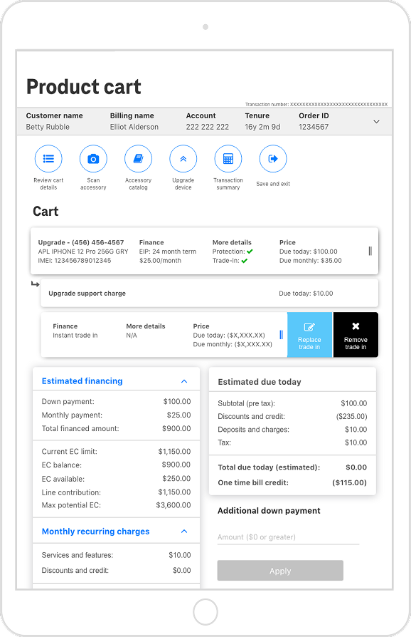
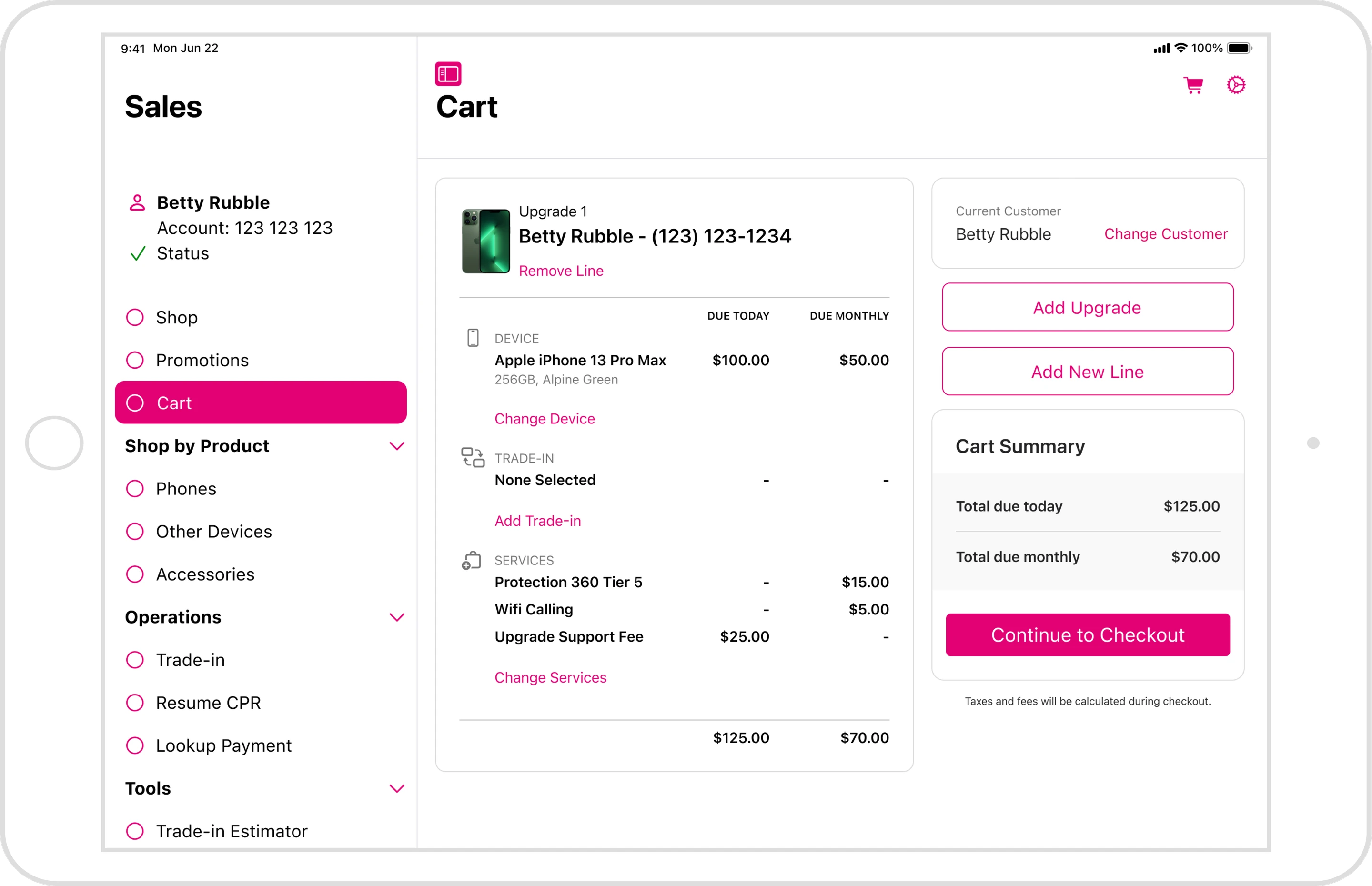
- Separated cart into a high-level product view and a detailed drill-down page for full line-item inspection.
- Structured payments into explicit due-today and monthly sections, validated through multiple rounds of user testing.
- Surfaced additional transaction entry points as a persistent action bar, keeping them accessible without competing with checkout.
and many more
The Sales experience was more than its primary flows. Across promotions, edge case transactions, and account management tasks, I designed the supporting flows that kept the end-to-end experience coherent for Mobile Experts across every type of customer interaction.
No product is ever truly final. Anticipating future iterations and structuring designs to accommodate evolving requirements leads to a more sustainable, scalable user experience.
Project end
By the fall of 2022, I had come a long way as a designer and learned an incredible amount from my time at Accenture. However, a shift in leadership priorities led to the expiration of our contract, and the team was rolled off the project. The Native iOS Journey would continue without me, with many selling flows still left to explore.
But all was not lost! Before our departure, we successfully launched the pilot version of the Native Upgrade, Trade-In, and Cart flows—and the feedback was overwhelmingly positive.
User satisfaction increased by 33% compared to the previous applications.
A significant drop in incomplete transactions confirmed that we had addressed a major pain point.
Qualitative research highlighted excitement from long-time employees.
"Eight-year tenure on the magenta side—this is one of the best updates I've ever seen! Big thanks!"
"Love how simple the trade-in tool works!"
The best designers don't chase novelty for novelty's sake; they identify what works and apply it thoughtfully. It's okay to borrow from proven patterns and established industry standards when they serve the user's needs.
My redesign
Description about how I decided to redo the design on my own time after all the lessons I learned during the 2 year project.
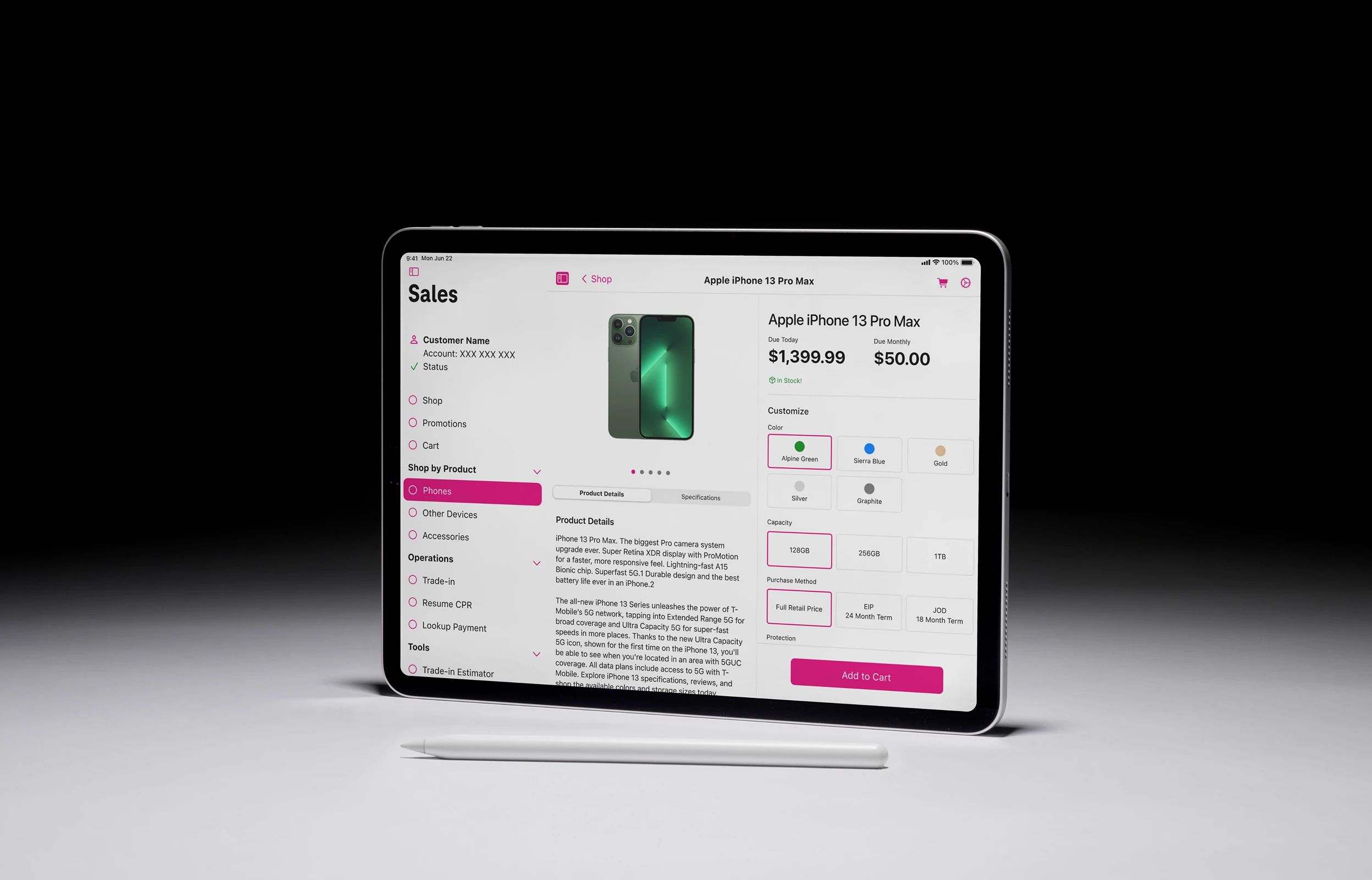
UI overhaul
- Adopted Apple's iPadOS design components for a more familiar and seamless experience.
- Increased white space to improve visual hierarchy and readability.
Flexible upgrade
- Introduced a modular upgrade process, allowing users to start from multiple entry points:
- Device catalog (if they already knew what they wanted).
- Trade-in evaluation (to see potential credit toward a new device).
- Promotions search (to maximize savings).
Universal trade-in
- A single trade-in flow that works across every purchase type, with device value and customer savings surfaced upfront rather than buried in the transaction.
Promotion catalog
- Designed an easy-to-navigate promotions hub where users could view active deals and requirements upfront—eliminating the need for verbal "trust me" explanations.
Accessory purchase
- Created a streamlined accessory selection flow that mirrored device selection but accounted for the different purchasing behaviors of customers.
Real-world work experience is invaluable, but some of the most fulfilling projects come from personal passion. If you feel the drive to push a project further, chase it—it's too easy to become consumed by day-to-day tasks and lose that creative spark.



Conclusion
This remains one of the most impactful and formative projects of my career. There were times I felt frustrated with stakeholders, unsure of how to structure my work, and burned out from seeing magenta everywhere—but my time at Accenture set me up for success in ways I never expected. It shaped how I approach complex design challenges, collaborate with teams, and advocate for both users and my own role as a designer.
Though my contributions to the Native iOS Journey came to an end, the experience continues to influence my work, reminding me that growth isn't just about success—it's about learning, adapting, and always striving to do better.